

POCATELLO — The city of Pocatello is making progress on its rebranding campaign following a work session meeting where the HUB Collective presented a slideshow that showcased three potential new logos and two new taglines.
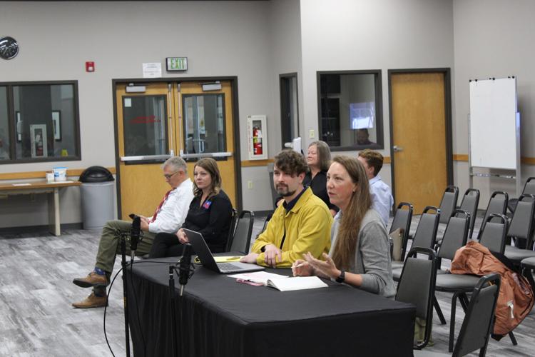
Representatives from the Portland based HUB Collective, a design and strategy company, presented a robust slideshow that took Pocatello Mayor Brian Blad and the City Council through its design process and offered three distinct logo redesigns for the city and its brand.
“We’ve been working with the city for the past several months on developing the right brand direction for the city,” HUB Creative Strategist Bryan Buenacosa-Brooks said. “We wanted to share with you a little bit of what that process has been like, who all we talked to, what we came to the conclusions about, and then wanted to share three different directions that we have on the table to decide about which one we’re going to go with.”
HUB collective then detailed the project goals, which works to create a brand system that instills confidence in the city as a trusted service provider, inspires pride in place for the local community, builds a unique identity that differentiates Pocatellto from its neighbors, considers how the brand may work with or complement the city flag and is easy to read, use and implement.
Last year, HUB Collective spent time gathering community feedback at locations like City Hall, the Marshall Public Library, Franklin Middle School and during meetings with institutions such as Idaho State University and organizations like the Chamber of Commerce to get ideas on why local residents love their town and ways they can improve the city’s image.
“We settled on these attributes of accessible, hardy, genuine, easygoing, playful, open, supportive, accommodating, and there’s a sense of anticipation here,” HUB Director of Career Development Jen Guibord said. “The way that this translates to us is a desired change or feeling or emotion...of feeling very grateful for all (that) the city’s providing, or (that) we have what it takes and that gives a sense of pride. We’re very connected. We’re very community driven. We get along, this is that unified community feel that we experience here. We don’t take ourselves too seriously, that’s that little bit of surprise and delight. There’s space for me, everyone feels like they belong in this community. People are looking out for me. I feel very valued as a member of the community.”
Guibord continued, “Those are the attributes and the emotions that we brought to our studio team and said, ‘This is what the brand should impart, this is what we want people to feel, because it represents, authentically, what and who Pocatello is.’”
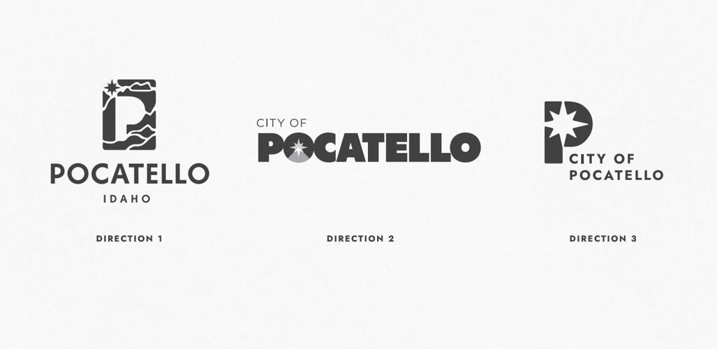
HUB Collective then presented the three different logo options, beginning with the “Landscape of Home” concept.
The design incorporates an empty “P” logo surrounded by the ebbing flow of shapes that give the concept art a mountainous backdrop. In the top left corner, the compass rose of the city flag stands out distinctly. The tagline “Home is All Around You” was incorporated into this concept, along with a few alternative color palettes for the logo like red, green and grey for various city departments.
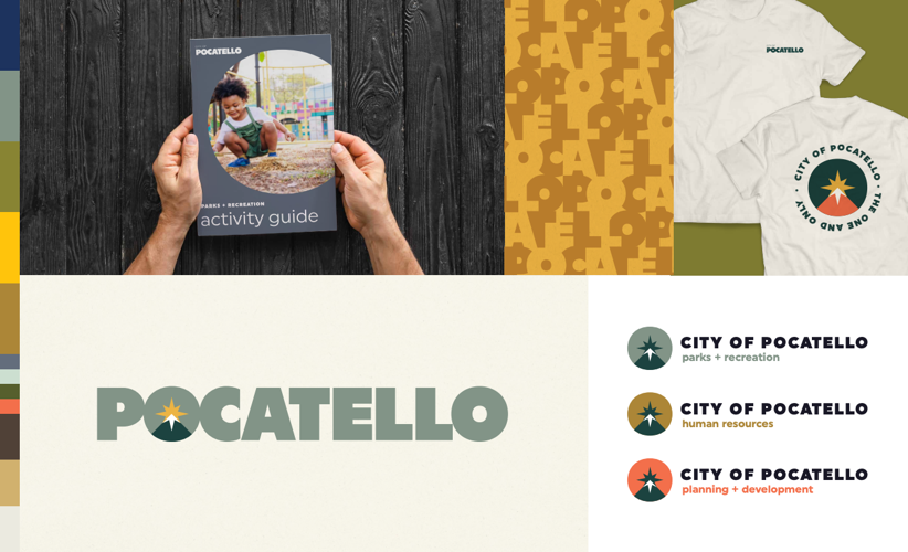
The second concept, which was called “The Space Between,” incorporates a bold font type for Pocatello and plays with the first “O” in the word by affixing a triangle mountain shape with a bright yellow compass rose at its peak, simulating a sunrise behind it. Again, alternative color schemes were displayed for different city departments. The tagline “The One and Only” was detailed here, playing off the fact that there is no other city on the planet with the name Pocatello and uplifting the idea of the city’s uniqueness.
The final design direction was “The Compass Rose” and placed the aforementioned star-like shape into a large “P” logo. This concept played more on utilizing the full city of Pocatello name while still playing around with a few different color schemes. This concept was the simplest and most straightforward of the three.
Not all in attendance were enthused about the various designs presented to the Pocatello City Council with Pocatello for Accountable Government Entities, or P.A.G.E., member Heather Disselkoen concerned about a comment made by Pocatello Chief of Staff Ann Nichols in response to a council member asking if the proposed three concepts were presented to the community.
“No, this is not being presented to the community, mostly because this is the city’s company logo and so we need to present it to you (the council), but we wanted to have the logo for our company designed with input from the from the community, which is why HUB came here in March and did all of the meetings with all of the people,” Nichols said at the meeting. “But then when it comes down to choosing our company logo, we’re leaving that to you (the council).”
Disselkoen e-mailed the following statement to the Idaho State Journal in response.
“This misguided, exclusionary thinking fails to recognize that rebranding isn’t about creating a ‘company’ logo,” Disselkoen said. “Our city logo and tagline are visual representations of the identity of Pocatello for all of us. It’s disappointing that our elected city representatives have failed to identify and communicate objectives, measurable metrics and a vision, and chosen to eliminate community input and insight regarding the final proposed two taglines and three visual systems from all but one stakeholder group.”
After discussion among the mayor and City Council members, who each provided input regarding the aspects of all three designs and the two taglines that they enjoyed most, five of six council members expressed the most interest with direction two, “The Space Between” and the tagline “The One and Only”.
The HUB Collective will now take the feedback it received from the Pocatello City Council and make further alterations, changes and put further emphasis on the decided direction for the rebrand.
During its regular meeting at 6 p.m. on Thursday, the City Council will vote to approve a resolution to adopt “The Space Between” logo and associated tagline. The meeting will be held at City Hall.
(1) comment
Pocatello is not a company and it's disingenuous to either infer or outright state that it is. But if one is to take that statement at face value, then we residents are stockholders and we certainly have the right to an opinion about our logo and slogan. This whole process is tainted by Ms. Nichols' vain and inappropriate statement. Open this process up so Pocatello's stockholders can voice their opinion.
Welcome to the discussion.
Log In